Best Web Design Practice To Use When Designing Your Company Website
-

Aaron Gray
- Blogs
-

 May 18 , 2018
 -
 7 min read


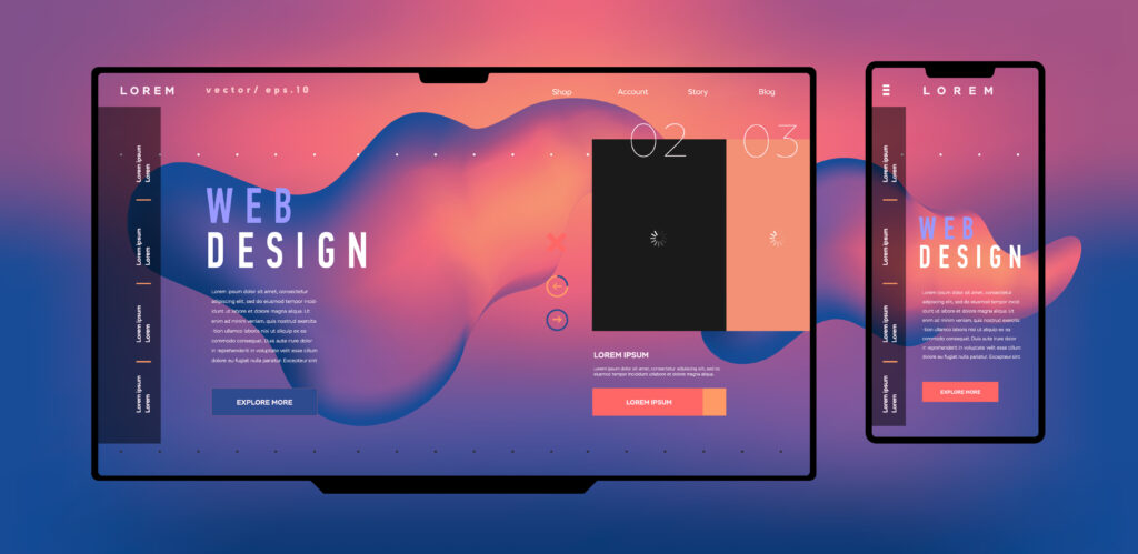
For any business to make their mark in their industry, they need to create a powerful website to bring in the traffic, clients and customers they need to promote a good ROI. When creating a website, the design of it needs to be great, interesting, and attractive to your viewers. The problem is however, that many businesses don’t realise this or don’t take the time to create a well-designed website which can really improve their overall reputation. So how do you design a website that ticks all the boxes? Well, let’s take a moment to go over the best web design practices to use when it comes to designing your company website. Remember though, if you feel overwhelmed by creating a website you can easily utilise web design and development outsourcing services to hire a web design and development company to do the job for you. These companies such as Studio 56 generally offer professional web design and development services which can create a powerful website for small business operations and other people.
Best Practices To Use When Designing A Company Website
Think About Website Colours
Website colours in your web design are important as they help to bring people in and catch their attention. When it comes to choosing website colours, it’s important to remember these few helpful tips.
- Choose colours that complement one another. For example, black, white and red are good combinations along with black, yellow, and red. Avoid colour pairs that don’t normally go together, as this can make your site look unattractive and hard on the eyes.
- Choose only 2-3 colours for your website design. Using too many colours can make your site look cluttered. However using up to 2-3 colours keeps it fresh and easy on the eyes.
- Choose colours that represent your theme, niche, and design well. A calm and relaxing site should have colours of blues and yellows for example. If you put red on a calm designed website it can make it appear upbeat and urgent.
Choosing colours for your website come down to really what you’re trying to achieve in the look of it and the colour psychology behind it. Take a look at some colour meanings to help you choose the best ones for your needs.
Keep It Simple And Fresh
When designing a website for your company, you need to remember that it needs to reflect your brand to a T. Your first impression is the most important to transform your visitors into paying customers. If you don’t make a good first impression through your website design, you’ll find that your bounce rate will be higher than expected. To make a great first impression, your website design needs to be simple, unique and overall fresh to attract attention to itself.
While you can use already-made templates to create your website, it’s best to work on a custom design, after all you don’t want to be like everyone else on the internet do you? If this is the case your visitors will have problems remembering you from the competition. Some tips to keeping it simple and fresh include:
- Use a maximum of 2-3 colours on your design. Too many colours can cause the page to look cluttered and can overwhelm your visitors.
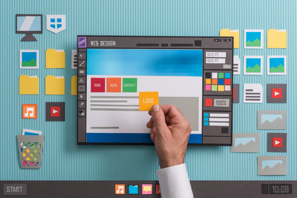
- Use your logo once on the page. Generally, this is at the top left hand side corner. Create a navigation point on your logo so it redirects users back to the homepage if they get lost.
- Don’t over-clutter your website with imagery. While a set amount of images are good to use on your website, it can cause problems with an overwhelming visual effect.
- Break content up into manageable pieces to read with bullet points and paragraphs. This will help to balance the whitespace on the page with the content without it being too overbearing for your readers.
Keep A Check On Website Load Times
Slow websites tend to cause frustration for visitors. If a visitor can’t load a page they want within the first 3-5 seconds, you’ll have a higher risk of page abandonment. This is why it’s crucial to check your website load times to reduce the risk of a high bounce rate. If you find your website pages are slower than normal, there are a few things you can do. These include:
- Select a suitable server that can handle your website dreams. Different servers can handle different things, so always check to see whether it can handle what you have planned for your website.
- Minimizing high animation content such as videos or moving images, unless your website has been specifically setup for this type of content. A website which isn’t setup for this type of content will run and load a lot slower than those such as YouTube which are specifically designed for videos.
- Remove any non-essential content, images, or broken links which may be affecting the load time.
- Minimize the need for visitors to be redirected to different pages. Redirections take a few minutes to complete and can cause problems with load times.
Don’t forget to make sure it’s mobile ready and loads well on mobile devices.
Create A Great Navigation Experience
Any web design and development company will tell you that the navigation is one of the most important design elements when developing your website. How well your visitors navigate your website and find what they’re after, goes hand in hand with how many conversions you can achieve from your website. Some tips to help create a great navigation experience and layout includes:
- Placing navigation points in easy to find areas. Generally, down the left hand side or across the top of the website is the best areas for navigation points to be positioned for best results.
- Upon navigating your website make sure your visitors only go as deep as 3-4 tiers. The category, sub-category and the product or service. If visitors have to really search through hundreds of different navigation tiers, it will cause frustration resulting in visitors abandoning their search.
- Name each navigation point clearly and with relevant words so visitors can find what they’re after by just seeing the words.
- Try to keep the main categories to a max of six to seven unless you really need to go over this. Too many categories can cause the user experience to be overwhelming and confusing.
- Incorporate a search bar at the top of your screen to help visitor find what they’re looking for.
Upon creating your website’s navigation it’s important to try it for yourself. Work out a product you want to look for and see if you can find it within a few minutes. If you can’t, you can bet that your visitors will be having problems as well. Don’t fall into these navigation mistakes
Overall
When it comes to designing your website there are so many things that you will need to consider in order to make your website the best it can be and lower your bounce rate. So are you hiring a company to handle your website development? What design element are you going to work on first?
Subscribe to Our Blog
Stay up to date with the latest marketing, sales, service tips and news.